Product design direction / Information architecture / UI and UX
Grove
by Sutter
Health
Founding designer / internal web-app design
An internal teaching-platform web app for physicians, social workers, and caregivers in the Grove model.
Presented to stakeholders, but not put into training use.
Project overview
This internal teaching-platform design brings education, resources, and practical tools together for healthcare professionals learning a community-centered model of care. The work explored how a substantial content library could feel clear, usable, and calm.
- Role
- Founding designer · Information architecture · Navigation · UI and UX · Design language
- Intended audience
- Physicians, social workers, and caregivers learning the Grove model
- Implementation approach
- A custom Grove visual direction paired with adapted Tailwind component patterns, giving development a reliable starting point while keeping navigation and learning flows tailored to Grove.
“He went above and beyond in delivering an exceptional product for our team.”
01 / Information architecture
A learning system starts with a clear map.
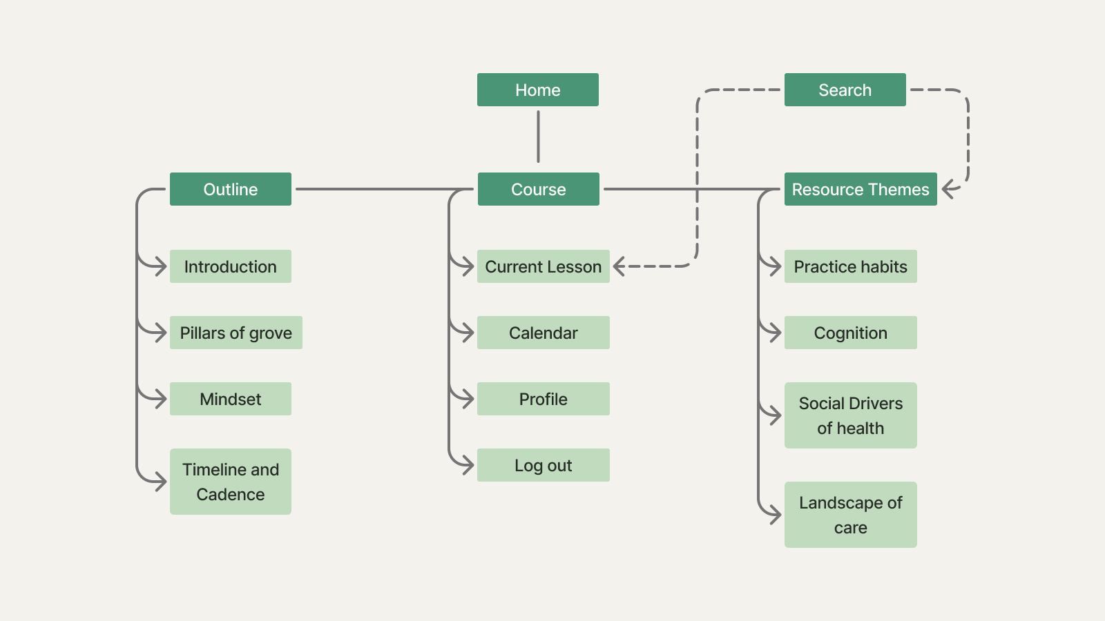
Content was audited and organized with the course director and development team before interface patterns were defined. The architecture maps clear paths through the course, account, and resource library.
02 / Navigation
Keep orientation visible.
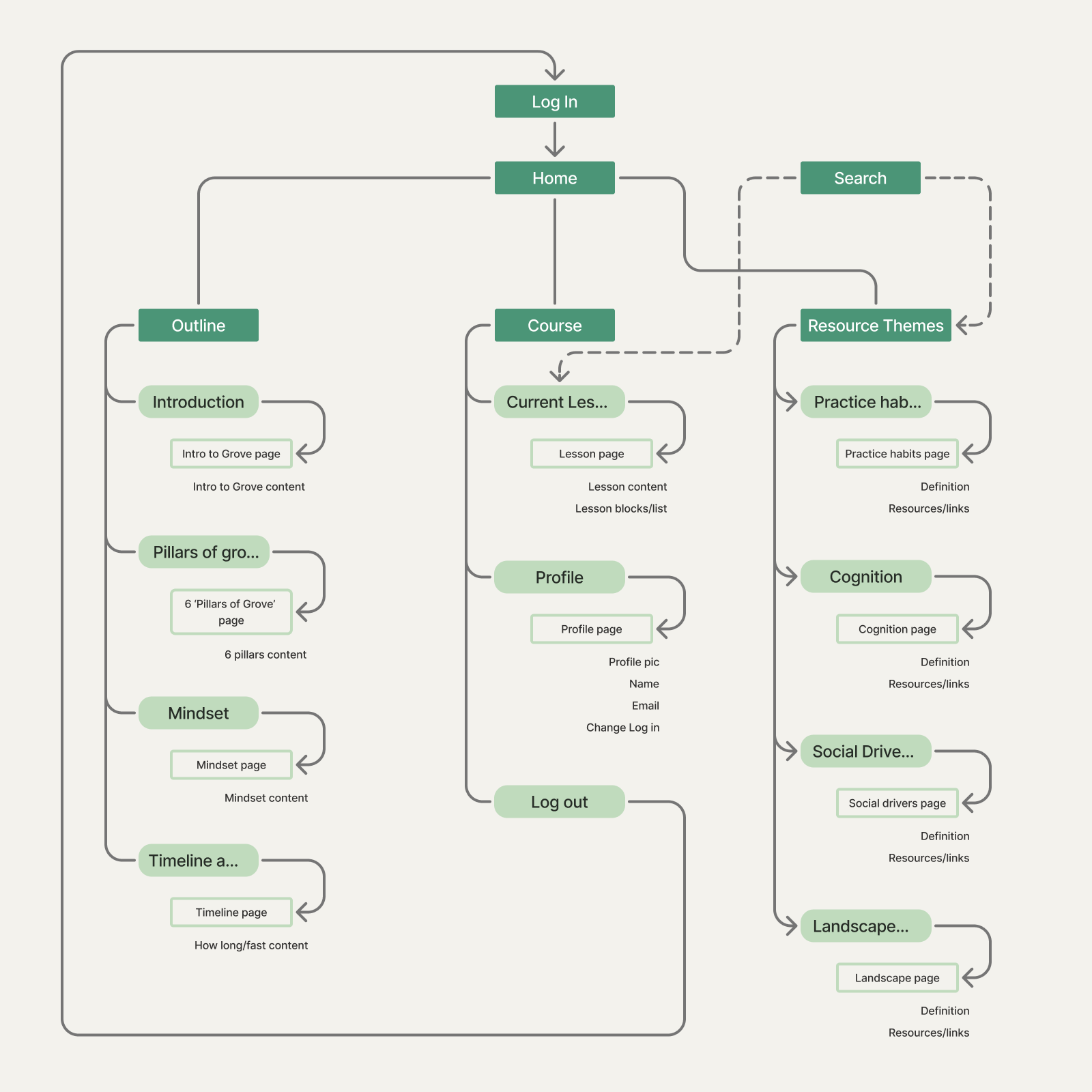
A content audit and user survey informed a navigation system designed to remain visible wherever space allows, and easily accessible when narrower browser widths make a persistent layout impractical. It gives learners a clear sense of place without asking them to remember where key content lives.
03 / Wireframing
Make the work of learning feel manageable.
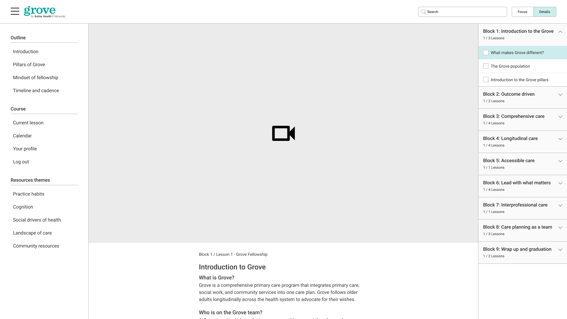
The course design uses a practical three-part structure: persistent navigation, focused learning content, and a flexible details panel. Starting with the course page made the content-heavy part of the product legible before the rest of the system was defined.
Style guide
A calm system for complex learning.
Internal care-model references informed a visual language of connection and support. A restrained palette of greens and neutrals, paired with Lora and Roboto, translates that direction into a clear, approachable internal learning experience.
01 / Visual language
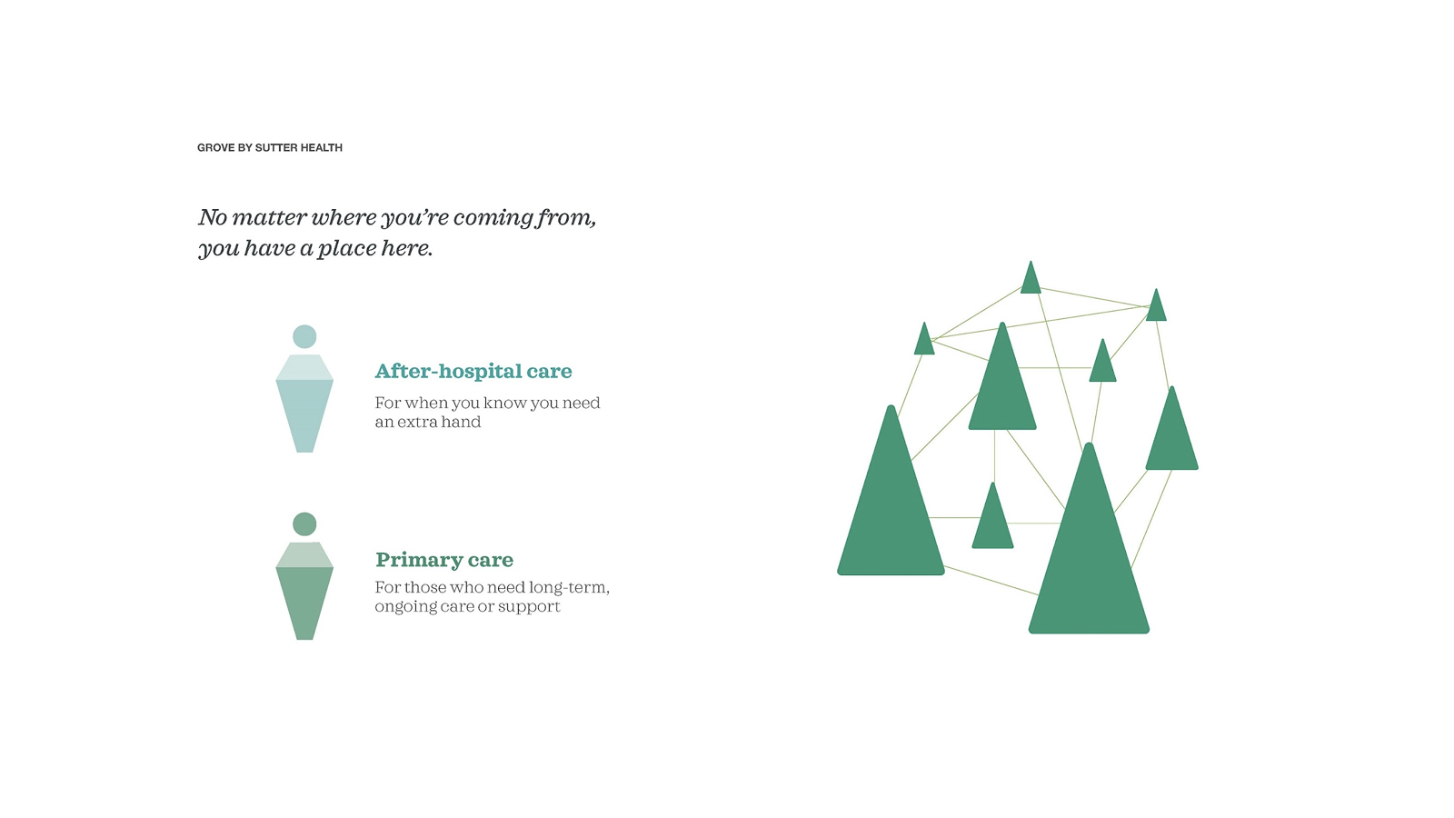
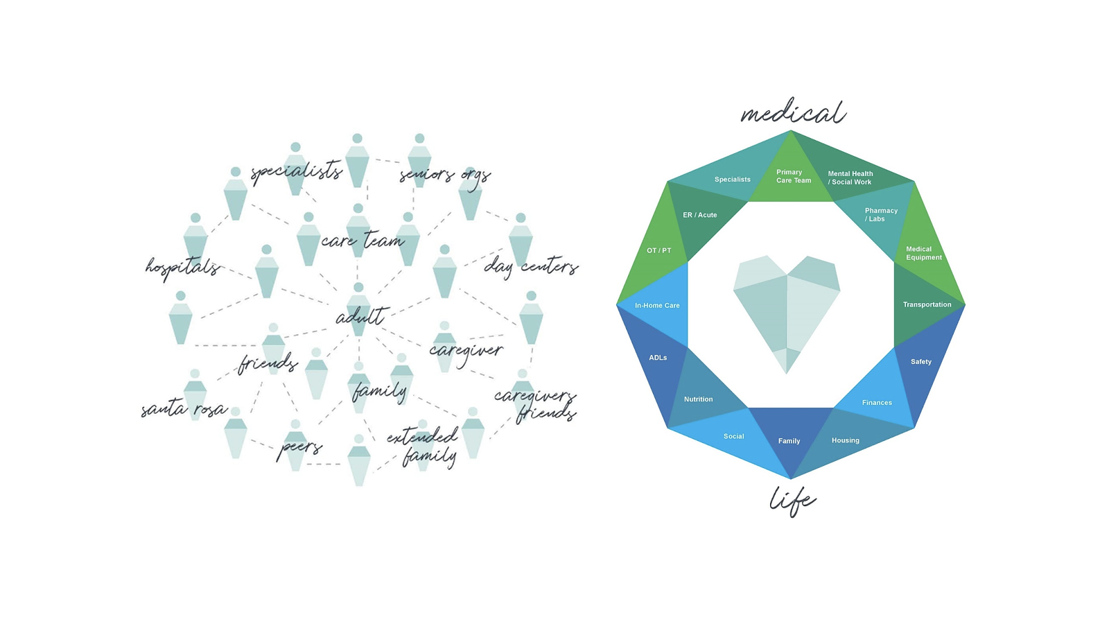
Internal presentation references informed the direction: care pathways, an interconnected forest, and systems that make a community of support visible.

Care pathways
A care-pathway diagram pairs a human figure with a connected forest—an early cue for balancing practical support with a sense of community.
The Grove metaphor
Layered triangular forms established the forest motif: individual shapes operate independently, then build into a connected landscape.
Care models
Network maps and the medical–life model offered a way to make relationships between people, care teams, and services feel legible.
A distinct identity within a trusted system
Soft, considered motion brings the geometric system to life, reinforcing a visual direction that could sit alongside Sutter Health while giving Grove a clear, community-centered identity—without attempting to extend Sutter’s official design library.
02 / Color
A compact palette of crisp neutrals and calming greens keeps the Grove experience readable, recognizable, and warm.
03 / Typography
Lora Regular is reserved for two editorial display moments. Roboto Regular and Medium create a compact, consistent interface scale from utility copy through to page-level prompts.
Display / Lora Regular
Lora · 36 / 48
Display / Lora Regular
Lora · 24 / 32
Copy in context
A community that cares for a community.
A learning platform training physicians, social workers, and caregivers in the Grove model.
Interface / Roboto Medium
Roboto Medium · 12 / 18
Roboto Medium · 14 / 22
Roboto Medium · 16 / 24
Roboto Medium · 18 / 24
Roboto Medium · 24 / 32
Interface / Roboto Regular
Roboto Regular · 12 / 18
Roboto Regular · 14 / 22
Roboto Regular · 16 / 24
04 / Components and states
Segmented selection and form fields define the product’s key interaction patterns. The specimens stay legible from a compact mobile stack through to side-by-side desktop comparisons.
Segmented control
Default

Hover

Selected

Selected + focus

Email address field
Default

Filled

Active

Error

Password field
The shared field structure stays consistent, while masking, visibility, and validation provide password-specific feedback.
Active / masked

Filled / visible

Error / masked

05 / Responsive patterns
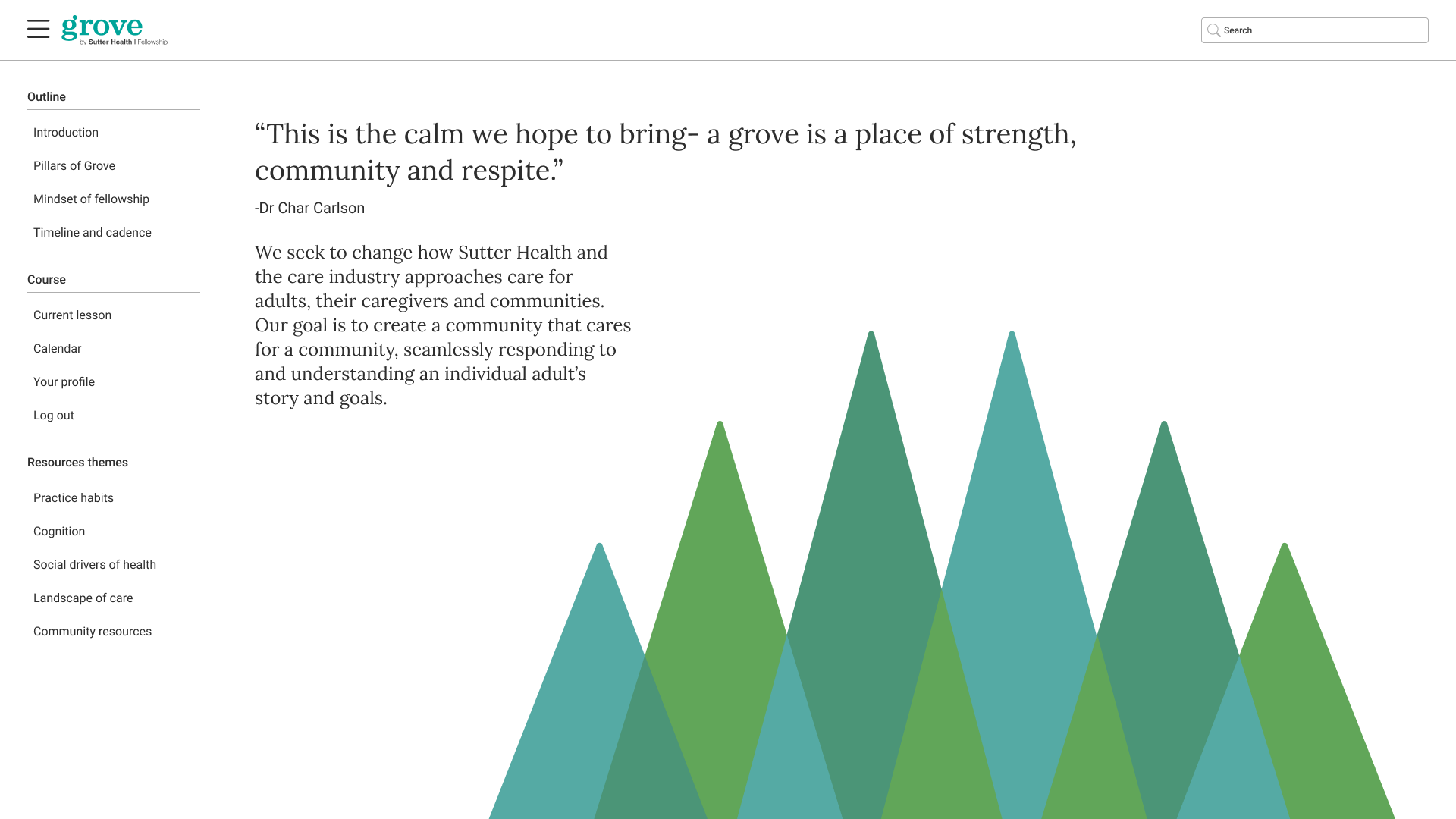
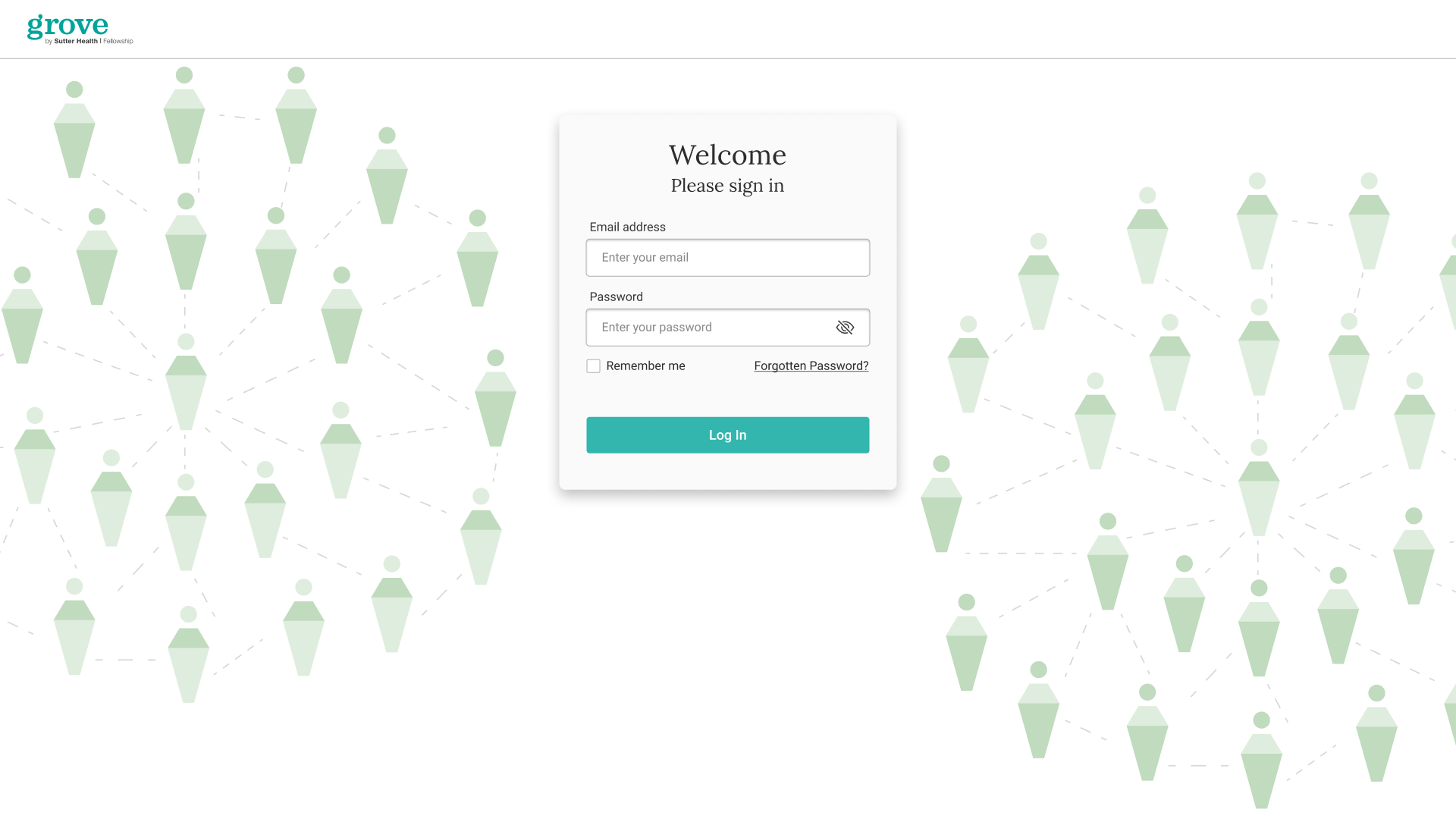
Reference frames capture the same key experiences at 1920px, 1440px, 768px, and 375px. They show how navigation, content hierarchy, and visual context adapt as available space changes.
Homepage
The homepage moves from a persistent course outline on larger screens to a compact navigation pattern at narrower widths, while retaining the Grove story and visual language.
Login
The sign-in experience keeps its focused form and calm care-network background across every width, scaling the surrounding visual field rather than changing the task.
Video lesson
The lesson view prioritizes the active video and course context, then reorganizes navigation and supporting detail as the available reading space changes.
04 / Focus mode
Less interface when attention matters.
Long-form lesson text was constrained to roughly 76 characters per line to support steady reading, while Focus Mode collapses secondary navigation and surrounding interface. The aim was to support concentration without taking useful context away from learners.
05 / Mobile search
Resources when the work is happening.
For learners working in patient environments, the resource library was designed to be reachable quickly on smaller screens. Search and direct lookup were treated as primary paths rather than secondary utilities.
Grove by Sutter Health
A connected learning experience, designed with care.
A proposed internal platform bringing course content, navigation, resources, and a distinct Grove visual language into one calm, adaptable system.
This portfolio was designed and refined by Steven Bryan in Ship Studio with Codex—using AI as an iterative design and build collaborator.